Aucune base de données
Toutes les données sont stockées dans des fichiers xml. Une simple copie de fichiers permet de déplacer votre site sur une clé usb, ce qui le rend complètement portable.
Collaboratif
5 profils avec des niveaux d'autorisations différents. Pour la famille, les amis, une entreprise, PluXml trouvera sa place.
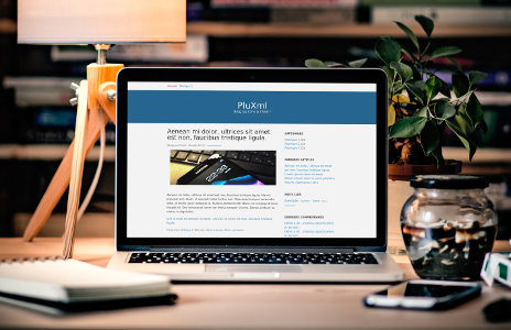
Personnalisable
PluXml s'habille suivant vos envies pour que votre site soit à votre image. Etendez votre PluXml sans aucune ligne de programmation en ajoutant facilement des nouvelles fonctionnalités.
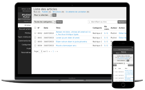
Principales caractéristiques
- Aucune base de données requise
- Portable sur clé usb
- Multi-utilisateurs avec des niveaux d'autorisations différents
- Pages statiques, catégories, gestion des tags, archives
- Gestion des commentaires
- Gestionnaire de médias : images, documents
- Flux Rss des articles, commentaires, tags, catégories
- Traduit en 11 langues (français, allemand, anglais, espagnol, italien, néerlandais, occitan, polonais, portugais, roumain, russe)
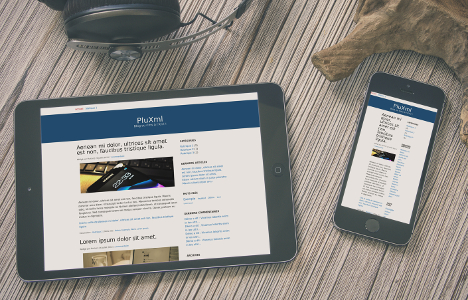
- Thèmes personnalisables (supporte les thèmes pour appareils mobiles et smartphones: iphone, blackberry, pocket-pc...)
- Plugins
- Réécriture d'urls
Pré-requis
- Serveur Apache, Nginx ou Lighttpd
- PHP 7.2 ou supérieur
- Librairie GD pour la gestion des images
- Fonction php d'envoi d'email autorisée (non obligatoire)
- Récuperez l'archive téléchargeable sur cette page et dézippez la à la racine de votre site
- Connectez-vous à votre site et suivez la procédure d'installation affichée à l'écran
- IMPORTANT: Sauvegardez le dossier data de votre PluXml
- Récuperez l'archive téléchargeable sur cette page et dézippez la à la racine de votre site de manière à écraser les fichiers existants
- Connectez-vous à votre site et suivez la procédure de mise à jour affichée à l'écran